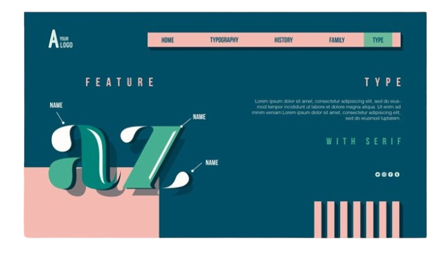
Typography in Web Design is a vital component that can make or break your website’s user experience. It enhances readability, conveys your brand’s personality, creates visual hierarchy, and builds consistency. By following best practices and paying attention to details, you can leverage typography to create a compelling and engaging online presence.
In the digital age, the significance of typography in web design cannot be overstated. Typography is more than just choosing fonts; it’s about creating an immersive and engaging user experience. Whether you’re designing a corporate website or a personal blog, the right typography can enhance readability, convey the brand’s personality, and keep visitors engaged. In this blog post, we will delve into the importance of Typography in Web Design and how it can transform your online presence.
Why Typography Matters
-
Enhancing Readability
One of the primary roles of typography in web design is to enhance readability. Good typography ensures that the text is easy to read and comprehend, which is crucial for retaining visitors on your site. Choosing the right typeface, font size, line height, and spacing can significantly impact how your content is perceived and read. When Typography in Web Design is executed well, it guides the reader effortlessly through the content, making for a pleasant reading experience.

-
Conveying Brand Personality
Typography is a powerful tool for conveying a brand’s personality. The typefaces you choose can communicate various attributes of your brand, such as professionalism, creativity, playfulness, or reliability. For instance, a serif font might convey a sense of tradition and trustworthiness, while a sans-serif font can appear modern and sleek. By carefully selecting and pairing fonts, you can create a visual identity that resonates with your audience and reinforces your brand’s message.
-
Creating Visual Hierarchy
Effective Typography in Web Design establishes a clear visual hierarchy, guiding users through the content in a logical order. By using different font sizes, weights, and styles, you can emphasize key points and create a structured layout. Headlines, subheadings, and body text should be distinct from each other to help users quickly scan and understand the information. This visual hierarchy not only enhances the overall aesthetics but also improves user experience by making the content more accessible.
-
Building Consistency
Consistency is key in web design, and typography plays a crucial role in achieving it. By maintaining uniformity in typefaces, font sizes, and spacing across your website, you create a cohesive look and feel. This consistency builds trust and credibility, as users are more likely to perceive a well-organized and professional site. When Typography in Web Design is consistent, it reinforces your brand identity and ensures a seamless user experience.
Best Practices for Typography in Web Design
-
Choosing the Right Typeface
Selecting the right typeface is the foundation of good typography. Consider your brand’s personality and the message you want to convey. It’s essential to choose typefaces that complement each other and are suitable for different purposes, such as headings, body text, and call-to-action buttons. Avoid using too many different fonts, as it can create a cluttered and confusing look.
-
Optimal Font Size and Line Height
Font size and line height are critical factors for readability. Ensure that your text is large enough to be read comfortably on all devices, including mobile phones. A good rule of thumb is to use a minimum font size of 16 pixels for body text. Additionally, maintain an appropriate line height (typically 1.5 times the font size) to ensure that lines of text are not too close together or too far apart.
-
Contrast and Color
Contrast and color play a vital role in making your text stand out. High contrast between the text and background enhances readability and ensures that users can read your content without straining their eyes. Use colors that align with your brand’s palette, but make sure the text remains legible. For example, dark text on a light background or light text on a dark background usually works well.
-
Responsive Typography
With the increasing use of mobile devices, it’s essential to implement responsive typography in web design. Ensure that your text scales appropriately on different screen sizes and resolutions. Use relative units like ems or percentages for font sizes, and employ media queries to adjust typography styles based on the device’s screen size.
-
Testing and Iteration
Typography in Web Design is not a one-size-fits-all solution. It’s crucial to test different typefaces, sizes, and styles to find what works best for your audience. A/B testing can provide valuable insights into how users interact with your content. Continuously iterate and refine your typography choices to enhance user experience and achieve your design goals.
Conclusion
Typography in Web Design is a vital component that can make or break your website’s user experience. It enhances readability, conveys your brand’s personality, creates visual hierarchy, and builds consistency. By following best practices and paying attention to details, you can leverage typography to create a compelling and engaging online presence.
In the ever-evolving world of web design, paying attention to typography can set your website apart and leave a lasting impression on your visitors. As you embark on your design journey, remember that every typographic choice contributes to the overall user experience. At Tanbits, we understand the importance of exceptional web design and development services to help you achieve your goals.
By investing in good typography, you’re not just improving the aesthetics of your site; you’re enhancing the overall user experience and effectively communicating your brand’s message. Embrace the power of Typography in Web Design and watch your website transform into a visually stunning and user-friendly platform.
BACK


