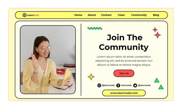
Minimalist Web Design is not just about using fewer elements on a page. It’s about creating a focused, purposeful experience for the user. By stripping away unnecessary clutter, this design approach highlights what truly matters—content and user interaction. The result is a clean, intuitive interface that guides users effortlessly toward their goals.
In the ever-evolving world of web design, trends come and go, but some principles remain timeless. One such enduring approach is Minimalist Web Design. Minimalist Web Design has become a hallmark of modern digital experiences by emphasizing simplicity, clarity, and functionality. But what exactly makes this design philosophy so effective? Why do big and small brands continue to embrace the mantra “less is more”?
The Essence of Minimalist Web Design
Minimalist Web Design is not just about using fewer elements on a page. It’s about creating a focused, purposeful experience for the user. By stripping away unnecessary clutter, this design approach highlights what truly matters—content and user interaction. The result is a clean, intuitive interface that guides users effortlessly toward their goals.
At its core, This Web Design leverages whitespace, limited color palettes, and simple typography to create a sense of order and sophistication. The absence of superfluous design elements allows users to focus on what’s important without distraction. This approach not only enhances usability but also improves the overall aesthetic appeal of the website.

The Key Principles of Minimalist Web Design
Several key principles define this Web Design:
1. Whitespace Utilization
Whitespace, or negative space, is one of the most powerful tools in this Web Design. It creates breathing room for elements on a page, reducing visual noise and making content more digestible. Whitespace helps guide the user’s eye to key areas, enhancing readability and navigation.
2. Simplified Navigation
Navigation should be intuitive and straightforward in a minimalist design. By minimizing the number of menu items and using clear, concise labels, designers can create a seamless user journey. Simplified navigation reduces cognitive load, allowing users to find what they need quickly and efficiently.
3. Limited Color Palette
This Web Design often employs a restrained color palette, focusing on monochromatic schemes or a few complementary colors. This limited palette not only creates a cohesive visual experience but also makes it easier to draw attention to important elements, such as calls to action.
4. Purposeful Typography
In this Web Design, typography plays a crucial role in conveying the brand’s message. Simple, sans-serif fonts are often favored for their readability and modern appeal. By using typography intentionally, designers can create a hierarchy that guides the user’s attention and emphasizes key content.
5. Focus on Content
Content is king in Minimalist Web Design. With fewer distractions, the content takes center stage, ensuring that users engage with the message rather than getting lost in ornamental design elements. This focus on content aligns with the broader trend of user-centric design, where the user’s needs and goals drive the design process.
The Benefits of Minimalist Web Design
Minimalist Web Design offers numerous benefits that make it a popular choice among designers and brands:
- Enhanced User Experience: With a focus on simplicity and usability, This Web Design creates a more enjoyable experience for users. The clean, uncluttered interface makes it easier for users to navigate and interact with the site.
- Faster Load Times: Fewer design elements mean less data to load, resulting in faster page load times. This is particularly important in today’s mobile-first world, where users expect websites to load quickly on all devices.
- Improved SEO: Search engines favor websites with clear, well-organized content. This Web Design naturally lends itself to better SEO practices, as it prioritizes content and reduces unnecessary code.
- Timeless Appeal: This Web Design transcends fleeting trends, offering a timeless aesthetic that remains relevant year after year. This longevity makes it a smart investment for brands looking to create a lasting online presence.
- Greater Focus on Conversion: By removing distractions, Minimalist Web Design can lead to higher conversion rates. With a clear visual hierarchy and prominent calls to action, users are more likely to take the desired action, whether it’s making a purchase, signing up for a newsletter, or contacting the company.
Conclusion
Minimalist Web Design is more than just a trend; it’s a philosophy that prioritizes simplicity, clarity, and user experience. In a digital landscape where users are bombarded with information, the “less is more” approach offers a refreshing alternative that resonates with modern audiences.
For businesses looking to create a website that stands out while remaining functional and user-friendly, Minimalist Web Design is the way forward.
At Tanbits, we offer web design and development services that help you harness the power of Minimalist Web Design to create impactful digital experiences.
As you embark on your next web design project, consider how minimalism can transform your online presence. By focusing on what truly matters, you can create a website that not only looks beautiful but also drives results.
BACK


