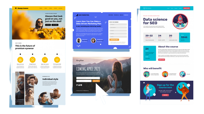
A landing page is a standalone web page specifically designed to convert website visitors into customers, leads, or subscribers. It is an essential element of any successful digital marketing campaign and serves as the first point of contact between a business and its potential customers.
A landing page is a standalone web page specifically designed to convert website visitors into customers, leads, or subscribers. It is an essential element of any successful digital marketing campaign and serves as the first point of contact between a business and its potential customers. To maximize the potential of your page and achieve high conversion rates, it’s essential to follow some best practices and understand what makes a landing page effective.
In this blog post, we’ll explore the key elements of an effective landing page and provide some examples to help you get started.
key elements of Effective Landing Pages
-
Focus on a Single Conversion Objective on the landing page
The primary objective of a landing page is to convert visitors into customers, leads, or subscribers. To achieve this objective, it’s essential to focus on a single conversion goal, such as filling out a form, making a purchase, or signing up for a newsletter. Having a clear and focused conversion goal helps to streamline the visitor’s experience and makes it easier for them to take the desired action.
-
Use a Clear and Concise Headline on the landing page
The headline is the first thing that visitors will see when they arrive on your page, and it must be both clear and concise. The headline should accurately reflect the main benefit of your offer and grab the visitor’s attention immediately. A good headline should be short, simple, and easy to understand.
-
Include a Compelling Value Proposition on the landing page
Your value proposition is the main reason why visitors should take the desired action on your page. It’s the core message that you want to communicate to your audience, and it should be clear, concise, and easy to understand. Your value proposition should be prominently displayed on your page and should explain the main benefits of your offer in a way that is relevant to your target audience.
-
Use Attention-Grabbing Images and Videos on the landing page
Images and videos are powerful tools that can help you to grab the attention of visitors and convey your message more effectively. They can be used to illustrate your offer, show examples of your product or service in action, or add some visual interest to your page. However, it’s important to use images and videos that are high-quality and relevant to your offer, as low-quality images and videos can negatively impact your conversion rates.
-
Include Social Proof on the landing page
Social proof is a powerful psychological principle that states that people are more likely to trust and take action when they see that others have done so before them. This can be in the form of customer reviews, testimonials, or social media metrics such as likes, shares, and followers. Including social proof on your page can help to increase trust and credibility, and ultimately lead to higher conversion rates.
-
Incorporate Strong Call-to-Action (CTA) on the landing page
A strong call-to-action (CTA) is critical to any effective landing page, as it encourages visitors to take the desired action. The CTA should be clear, concise, easy to understand, and prominently displayed on your page. It should also be action-oriented, using language that inspires visitors to take the desired action, such as “Sign Up Now,” “Get Started,” or “Learn More.”
Best Practices and Examples of Effective Landing Pages
To help you get a better understanding of what makes a landing page effective. Let’s take a look at some examples of great landing pages.
-
Dropbox:
Dropbox’s is simple, with a clear and concise headline, a strong value proposition, and a prominent CTA. The use of a color scheme that is consistent with the brand and a clean, uncluttered design. Also helps to create a positive user experience.
-
Mailchimp:
Mailchimp’s is playful and fun, with a unique design and quirky illustrations that help to capture the attention of visitors. The use of humor and a clear value proposition also makes it easy for visitors to understand what Mailchimp is all about. And why they should sign up.
-
Unbounce:
Unbounce’s is simple and professional, with a clear headline and value proposition that effectively communicate the benefits of their product. The use of a strong CTA, coupled with social proof in the form of customer testimonials. It helps to increase trust and credibility and ultimately drives conversions.
Conclusion
In conclusion, an effective landing page is a critical element of any successful digital marketing campaign. And it can help you to achieve high conversion rates and drive more business. By following the best practices outlined in this post, you can create a page that is optimized for conversions. And helps to engage and convert visitors into customers, leads, or subscribers.
So what are you waiting for? Check out Tanbits and start creating your effective landing page today! Our company can help you come up with an effective landing page that is not only user-friendly but also, highly visible on Google search pages. Contact us to learn more about our web design and development services.
BACK