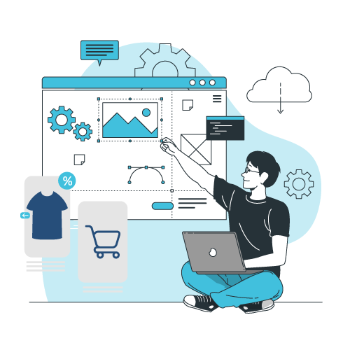
Ecommerce web design has changed a lot in 2022. Online shopping was already the norm but today, its even more ingrained in our lives.. Therefore, E-commerce store owners need to pay attention to the web design. The competition is fierce, as more stores have entered the market.
The world has changed a lot with COVID-19. From working to the ways people shop to educating oneself, everything took a 360 degree turn. Online shopping was already the norm but today, it is even more ingrained in our lives. Therefore, E-commerce store owners need to pay attention to the web design. The competition is fierce, as more stores enter the market. E-commerce store owners need to make their websites look great and highly functional. This is the only way to retain customers while attracting new people.
This blog will tell you about the latest ecommerce web design trends & benefits. You can combine them to see what happens. Or choose a single option and apply it to your store to change your platform’s game.
People love to shop on modern, bright, and responsive websites. So let’s find out more about what they want and how to attract them.
Latest ecommerce web design trends & benefits:
Interactive Design
People like to interact with brands in any form. That is why the trend that started a few years ago is growing in 2022.
There are many ways to use the brand’s marketing strategy with efficiency. Just like;
- Showcase the benefits of products by 3D modeling.
- Combine client feedback with micro-interactions.
- Tell the brand’s story by using interactive videos.
Asymmetric Layouts in ecommerce web design
Asymmetry can be a risky move to stand out from the crowd of competitors as if you overdo it, it may seem strange and unusual. But if you know the right formula for your brand, there will be hype.
Angles are everything when it comes to trends of 2022 website design.
A great website combines asymmetric layout and interaction. Animations make the website smooth and modern at the same time. Visitors feel as if they have arrived at an art gallery and not a site.
The more people are closer to the product, the more likely they are to buy it. Therefore, use AR and 3D to provide a real-time user-experience. These technologies immerse the consumer in the product. They help to convert even the most difficult type of users into buyers.
So in case your company retails goods, consider the virtual try-it-on. A dedicated app is a great solution. But at least the virtual try-on widget will increase engagement. It is the important thing to skyrocket conversions!
Typography-Based Design
In the 2010s, text meant more than just marketing۔ But there is a whole philosophy behind the big fonts in the 2022. People want to see fewer letters and more art. They want to be impressed and amazed. To keep clients at your fingertips, it’s best to use a typography-based design.
On some websites, the product is the font. Those entire websites sell one font. The design is massive, simple, and breathable. You can’t leave these sites without a craving to explore them and the engagement is high. This is exactly what your business needs.
Saturation And Bright Colors
It takes 90 seconds to form an opinion about the website or an app. And 90% of that opinion depends on the choice of color. To attract customers, you have to choose the colors wisely. People want to see the world in bright colors. If you are ready for some black and white scheme, make sure it looks incredible.
Another example of vivid colors that is used properly is the heycusp.com website. The design impresses from the first second. The color scheme is amazing and contrasting, but bright and optimistic. They also use interaction. When a user places the cursor on the case study, an image begins to wave.
Simplicity And Minimalism
35% of Americans want something minimal in their lives. And you can provide them by smoothing out your website or app. Great design is where the less is more. Good minimal designs can last for decades. Remember “Stay calm and move on”? It was posted by the British government in 1939. And we still use its patterns for inspiration and memes in 2022.
People want simple eCommerce web design solutions. The ecommerce web design is quite close to the famous “Keep Calm. phenomenon. It is bright, simple, and easy to scan. A user who’ll come there will understand the concept within seconds.
Shop-able Photos
Instagram introduced the Shop-able Photos feature in the fall of 2017. Since then, many brands have increased their traffic. For example, Natori got a 100% increase in revenue from Instagram. You can replicate this success by applying the Shop-able Lookbox. People like it because it brings a sense of belonging to a brand.
Shop-able photos are one of the best practices in ecommerce web design. It displays products in a way that allows the consumers to see with clarity and purpose. So the person gets immersed into the vibe as soon as it lands on the website.
Chatbots
80% of people would like to buy from brands that offer personalized experiences. How does it relate to bots?
Well, bots that are well-designed can boost your sales and save you time and money. Here’s how.
- Bots will reduce customer support department costs.
- Bots can help you create omnichannel marketing strategies.
- Bots can act as personal buyers. This will make your client feel great and increase your sales.
- Bots can help you re-target.
A bot is a great practice for ecommerce web design. It works more like a friend than a bot, like sending jokes and using emojis. It gives the correct answer naturally so that it makes sense to stay in touch with a brand. And as you remember, people love that feeling.
Personalization in ecommerce website design
77% of people recommend or choose brands with personalization. Therefore, you need to think about the distribution of your audience. You have to show people what they like. As a result, they will love your brand. Re-targeting the cookie will help you.
For example, ASOS makes the best use of re-targeting cookies. They collect information about consumer preferences, dropped carts, and more. When someone comes back, they offer discounts on interesting products. This makes the user-experience simple, beautiful and highly functional.
Dark Mode
In 2022, people are using Dark Mode more than usual. Dark elements make the website minimal, attractive and easily navigable. This makes the elements of the website pop out.
Dark themes are good for OLED screens as they save power and extend the life of the screen. It can make any website aesthetic and highly modern. Combined with the shining neon, the dark theme creates cyberpunk vibes.
Dark mode can be associated with every brand and Dark Mode makes the website even better, more dynamic than the Light Mode. Black and white images look good on the website. They stand in contrast with the overall design and connects the newcomer to the sense of time. Overall, Dark mode makes the website brighter than ever.
Wrap Up on ecommerce web design
Feel that your website needs a change in design? Connect with Tanbits professionals and hire eCommerce developers for your purposes. There is no limit to your ideas and it is the same with our teams.
We have dozens of such talents in our network. We will connect you with people whose skills are right for you. They will match your style, industry, technology, and company culture. This way your site will counter unlimited success and growth.
BACK


